The Power of Fonts: How Typographic Choices Influence User Experience
The power of fonts in digital design cannot be overstated, as typographic choices play a crucial role in shaping user experience. Different fonts evoke different emotions and reactions; for instance, a serif font often conveys tradition and reliability, while a sans-serif font may feel more modern and approachable. The right font can enhance readability and accessibility, making it easier for users to engage with content. Conversely, poor font choices can lead to frustration, decreasing the likelihood of returning visitors. Therefore, understanding the fundamentals of typography is essential for anyone looking to optimize their digital presence.
Moreover, the influence of typography goes beyond aesthetics. It can significantly affect usability and information hierarchy on a webpage. For example, using a consistent font style and size for headings, subheadings, and body text helps users easily navigate and digest the content. Additionally, considerations like line length, spacing, and contrast can all contribute to a seamless reading experience. By strategically selecting and applying fonts, designers can ensure that users not only appreciate the visual appeal of a site but also understand and value the information presented to them.
Maximizing Message Clarity: Best Practices for Web Typography
Maximizing Message Clarity through effective web typography is essential for enhancing user experience and engagement. A clean and easily readable typeface not only makes your content more accessible but also helps convey your message more effectively. To achieve this, consider font size, line height, and contrast. For instance, a minimum font size of 16 pixels is recommended for body text to ensure readability across devices. Additionally, maintaining a line height of 1.5 times the font size can significantly improve text legibility, allowing readers to follow the content without straining their eyes.
Another crucial aspect of optimizing web typography is the choice of fonts. It's advisable to use a combination of sans-serif for headings and serif for body text, as this provides a pleasing visual contrast while retaining clarity. Utilize white space effectively to separate distinct sections of your content, reducing visual clutter and guiding the reader's eye. Additionally, employing typographic hierarchy—through varying font weights or styles—can help draw attention to key points, thus enhancing message clarity. Remember, the ultimate goal is to create a seamless reading experience that highlights your content's value.
Typography Trends in 2024: What to Embrace for a Modern Web Look
As we dive into typography trends in 2024, it's essential to highlight the increasing use of variable fonts. These versatile typefaces allow for greater customization and flexibility, enabling designers to create dynamic and engaging visual experiences. With the ability to adjust weight, width, and style within a single font file, variable fonts not only enhance design creativity but also significantly improve website loading times. This trend supports the ongoing demand for faster and more responsive web designs, making it a vital consideration for modern web aesthetics.
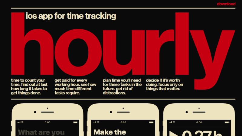
Another noteworthy trend is the rise of bold and oversized typography that commands attention. Websites are increasingly using large type to create a strong focal point, enhancing user engagement and readability. To effectively implement this trend, consider pairing bold headers with light text for a striking contrast. Additionally, exploring unique font pairings can bring a fresh perspective to your designs. As we move through 2024, embracing these typography trends will not only modernize your web presence but also elevate user experience to new heights.